Understanding the Influence of Color on your Mood
Understanding the influence of color
As an artist, I’ve come to realize that color alone can influence our feelings just as effectively as images and words.
“The hues and tones of the flowers I captured were capable of conveying a message or triggering a particular feeling in the viewer, which helped me to appreciate how effective my artwork could be in other people's spaces.”
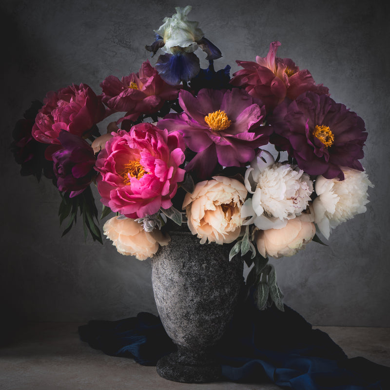
 Today, my understanding of color and how it elicits emotion plays a key role in my work. The images in my Sunflower Flower Prints Collection, for example, use the joyful tones of yellow and orange through a series of sunflower photographs designed to provide warmth and positivity. Evoking happy memories of such a fond time of year, each print captures the magic of the season through not only the choice of bloom, but the deeply saturated color that invites the audience to revisit their own summer recollections. In contrast, my Dahlia art prints depict dahlias in much gentler and calming colors for artwork that promotes a sense of serenity.
Color therapy in art
A combination of light and energy that’s perceived by the naked eye as the visible spectrum, color exists all around us and plays a major part in our overall well-being. For example, cool colors — such as shades of blue and green — are commonly associated with feelings of calmness, relaxation, and even sadness on occasion. By contrast, warmer hues of red, orange, and yellow are typically linked to comforting emotions as well as anger or hostility. Of course these connections are scientifically unverified and much like art in itself, everyone brings their own personal experiences and reasons for choosing specific colors to the conversation. Broadly speaking, however,
“the effect color has on our mood is indisputable and the inclusion of tinctures that speak to us individually is now encouraged as a form of therapy.”
With unique works of art widely available to the masses thanks to the improved quality of prints and the expansion of online shopping, one of the simplest ways to incorporate a particular hue into your everyday life is through displaying artwork in the personal space you occupy on a daily basis. 
Choosing the right artwork for your setting
With so many types of art to choose from, it can be especially difficult to narrow down your selection. When considering what artwork to exhibit in your home or work setting, take into careful consideration the main function of the room and how you would like it to feel. A bedroom should promote feelings associated with relaxation for instance, whereas a brightly-lit office or dining room may be more conducive to something that fosters creativity or playfulness.
For a soothing ambience in a place of rest, choose colors such as blush pink, purple, and blue.
“Some of my favorite bedroom art pieces include Burning White Light, Blushing Romance, and The Dew Drops of Joy. These floral art prints offer more muted pastel tones that invite thoughts of peacefulness and tranquility when displayed in a space. For a more vibrant approach, Perfectionism, Late Spring Morning Dew, and Familie from my Late Spring Collection offer warming hues of coral, gold, peach, and crimson that may be associated with optimism and energy.”
 When choosing artwork for a setting, it’s important to remember that color plays a crucial role in conveying feeling and influencing emotion. As such, the correct use of color can have a lasting effect on not only the room in which it’s displayed, but also the well-being of the people who get to experience it regularly. When it comes to my floral art prints, I like to think that all of my creations are capable of influencing the cognitive state of others when displayed in the homes and interiors of my collectors.
Harmonious colors
Another approach when it comes to exploring the world of color through art is keeping in mind how various shades, tones, and tints work together. The color wheel — first presented by Sir Isaac Newton — demonstrates that the hues of the rainbow share a harmonious relationship. Today this circular illustration depicting the link between primary, secondary, and tertiary colors can be used to discover combinations that help to enhance the visual quality of something, including our interiors.
Successfully decorating a space with numerous hues can be a little daunting without any design experience. Luckily, there are three simple methods to guide us in relation to the positioning of colors on the basic color wheel.
-
The first method is referred to as analogous - or similar tones. This approach pairs colors directly to the left and right of one another on the wheel.

- The second technique is complementary, which refers to using colors directly opposite each other. Generally employed as accent colors in a space, each hue on the wheel has exactly one complementary color — blue and orange, red and green, and purple and yellow for example.

- Finally, the triadic method pairs three colors spaced evenly in thirds around the wheel. This creates a high contrast aesthetic that’s sure to add personality to an interior.

Adding artwork to a room in analogous, complementary, or triadic shades, tones, and tints can really help to shape the overall ambience of a space, which in turn can alter our emotional state.
To help guide collectors on how to create harmonious color schemes through the introduction of art, I’m currently working on a brand new section of the Elena Dragoi website that allows viewers to search for artwork by color. This tool will encourage collectors to visualize chosen hues in new spaces — in turn allowing them to reimagine their own world and what they can do to recreate it in person.
Know your color
In conclusion, the thoughtful use of color can help to define an interior and knowing the meaning of certain hues inevitably makes the emotional impact of a room much more effective. Whether you’re looking to create a restorative retreat or a stimulating space, one of the easiest ways to influence your well-being is through displaying colorful artwork that promotes mood enhancement and welcomed feelings that resonate with its audience.
With love,